Ranking US States with Medicare spending: a story using interactive visualization tool (Tableau)
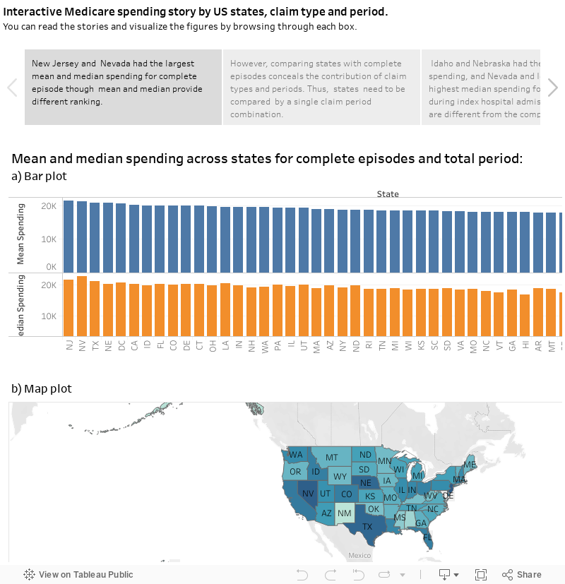
Earlier in my blog I explored the average Medicare spending per episode hospital data using R and R Shiny . Here, I explored the average spending across states, and by claim type and period as well as whether the mean and median leads to similar conclusion. Note that the data provided was average spending per beneficiary episodes, here after called spending, and described in more detail in my previous post. The story made using Tableau shows four stories:
The first story shows the mean and median total spending for complete episode across states. The second story explored whether the mean and median spending vary by claim type and period. Clearly there were a huge difference across claim type and period combinations. States need to be compared by a single claim period combination rather than complete episodes. Therefore, I explore the first two expensive claim type and period combinations (inpatient during index hospital admission, and skilled nursing facility during 1 to 30 days after discharge from index hospital admission, hereafter called after hospital discharge) in the third and fourth stories. The results were different from the complete episodes spending and also the mean and median spending gave different ranking.
Conclusion
The interactive story / dashboard developed using tableau helps to explore average spending. When comparing an overall effect of spending across state, factors such as, claim type and period should not be ignored. In addition, the mean and median may not always lead to similar conclusion. Therefore, caution should be taken in choosing the central measure, especially when dealing with skewed data and the purpose is ranking.